
Adjusted for inflation, the US economy has more than doubled in real terms since 1975.
How much of that growth has gone to the average person? According to many economists, the answer is close to zero.
In a recent gloomy study of the American economy, Thomas Piketty, Emmanuel Saez, and Gabriel Zucman find that almost none of the gains from economic growth accrued to the bottom half of the population. They write, “Looking first at income before taxes and transfers, income stagnated for bottom 50% earners: for this group, average pre-tax income was $16,000 in 1980—expressed in 2014 dollars, using the national income deflator—and still is $16,200 in 2014.”1 Piketty, Saez, and Zucman also found that incomes of the top 1% tripled over the same time period.
New York Times columnist David Leonhardt, reacting to this work, concluded “the very affluent, and only the very affluent, have received significant raises in recent decades.”
Most people believe that the middle class and the poor are stagnating, treading water, while the rich get all the goodies. Nobel Laureate Paul Krugman writes that “Wages for ordinary workers have in fact been stagnant since the 1970s.”2 Jared Bernstein writes in the New York Times, “for middle-income households earnings have declined in real terms 7 percent from 1979 to 2010.”3
But these depressing conclusions rely on studies and data that are incomplete or flawed. They understate economic growth for the poor and the middle class because they use measures of prices that mis-measure inflation. They leave out important components of compensation such as fringe benefits which have become increasingly important in recent years. Some studies include the elderly which lowers measured progress because the elderly are an increasing share of the population and they are less likely to be working full-time if at all.
And many of the most pessimistic studies about the fate of the American middle class ignore the breakdown in marriage among the poorest Americans and the effects that demographic change has had on the way we measure changes in household income.
But the biggest problem with the pessimistic studies is that they never follow the same people to see how they do over time. Instead, they rely on a snapshot at two points in time. So for example, researchers look at the median income of the middle quintile in 1975 and compare that to the median income of the median quintile in 2014, say. When they find little or no change, they conclude that the average American is making no progress.
But the people in the snapshots are not the same people. These snapshots fail to correct for changes in the composition of workers and changes in household structure that distort the measurement of economic progress. There is immigration. There are large changes in the marriage rate over the period being examined. And there is economic mobility as people move up and down the economic ladder as their luck and opportunities fluctuate.
When you follow the same people over time, you get very different results about the impact of the economy on the poor, the middle, and the rich.
Studies that use panel data—data that is generated from following the same people over time—consistently find that the largest gains over time accrue to the poorest workers and that the richest workers get very little of the gains. This is true in survey data. It is true in data gathered from tax returns.
Here are some of the studies that find a very different picture of the impact of the American economy on the economic well-being of the poor, middle, and the rich.
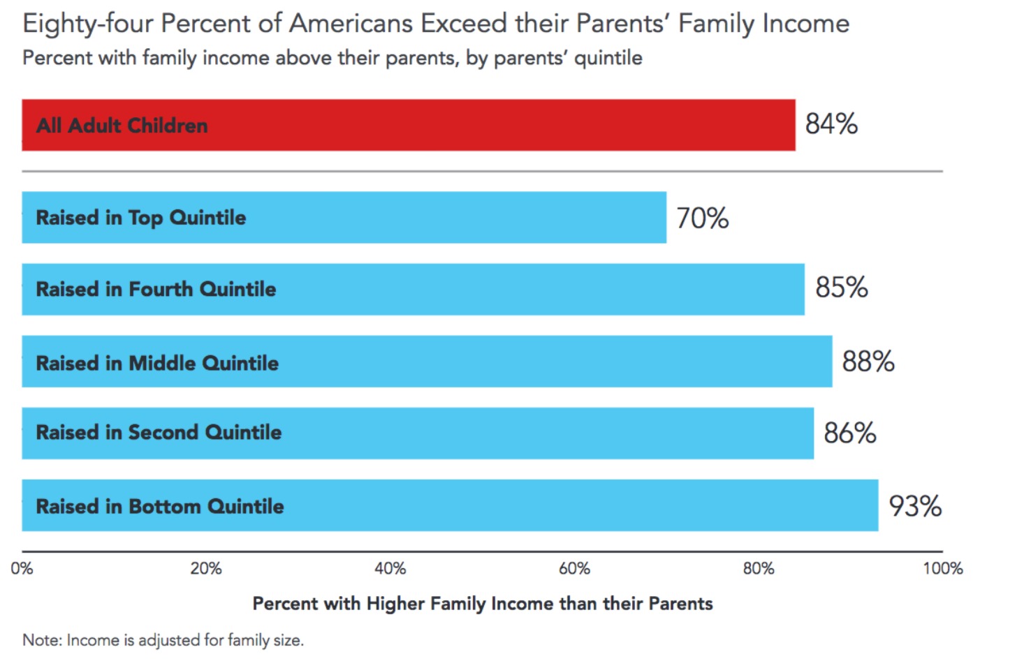
This first study, from the Pew Charitable Trusts, conducted by Leonard Lopoo and Thomas DeLeire uses the Panel Study of Income Dynamics (PSID) and compares the family incomes of children to the income of their parents.4 Parents income is taken from a series of years in the 1960s. Children’s income is taken from a series of years in the early 2000s. As shown in Figure 1, 84% earned more than their parents, corrected for inflation. But 93% of the children in the poorest households, the bottom 20% surpassed their parents. Only 70% of those raised in the top quintile exceeded their parent’s income.
Chetty et al find a similar pattern.5 In an otherwise gloomy assessment of American progress, they find that 70% of children born in 1980 into the bottom decile exceed their parents’ income in 2014. For those born in the top 10%, only 33% exceed their parents’ income.
The poor may find it easier to do better than their parents. But how much better off do they end up? Julia Isaacs’s study for the Pew Charitable Trusts finds that children raised in the poorest families made the largest gains as adults relative to children born into richer families.6
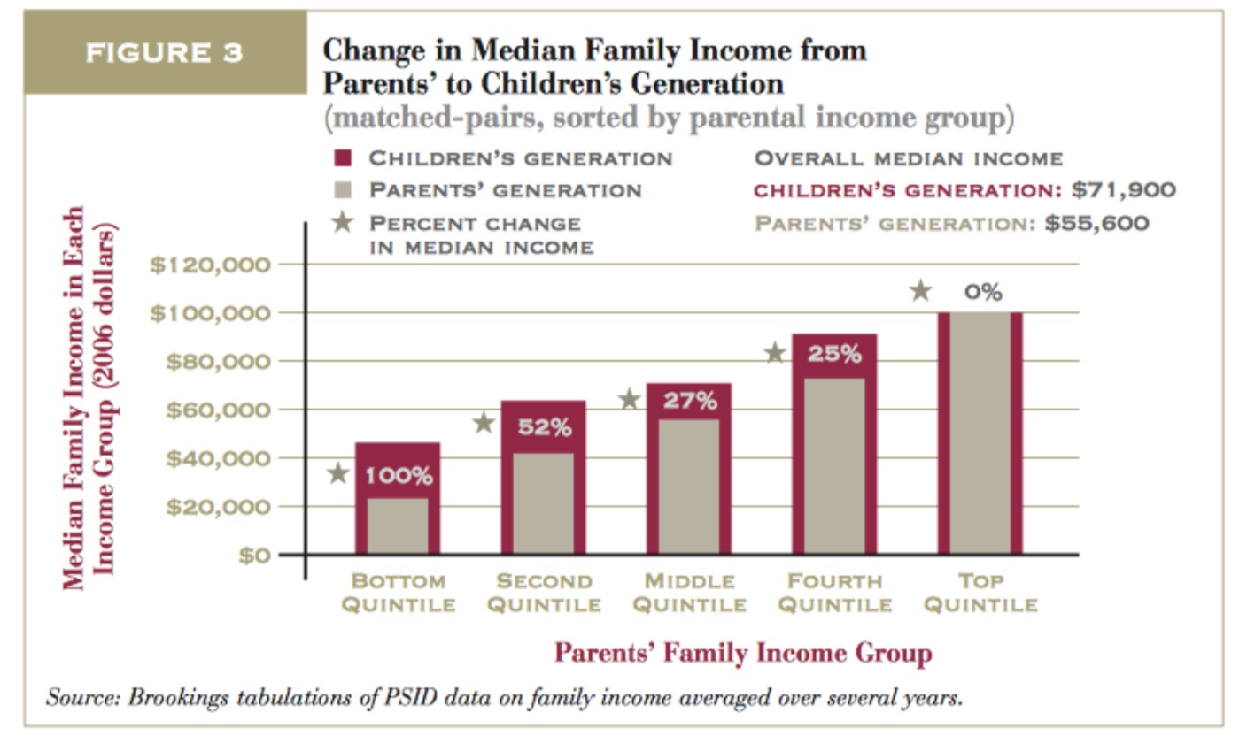
The children from the poorest families ended up twice as well-off as their parents. People in the top quintile did no better or worse than their parents. One explanation of these findings is there is regression to the mean—if your parents are particularly unlucky, they may find themselves at the bottom of the economy. You, on the other hand, can expect to have average luck and will find it easier to do better than your parents. At the other end of the income distribution, one reason you might have very rich parents is that they have especially good luck. You are unlikely to repeat their good fortune, so you will struggle to do better than they did.
But that doesn’t change what actually happened in the last three decades of the 20th century in the Isaacs study: the children from the poorest families added more to their income than children from the richest families. That reality isn’t consistent with the standard pessimistic story that only the richest Americans have benefited from economic growth over the last 30-40 years. Or that only the richest Americans have gotten raises. The pessimistic story based on comparing snapshots of the economy at two different points in time misses the underlying dynamism of the American economy and does not accurately measure how workers at different places in the income distribution are doing over time.
Gerald Auten, Geoffrey Gee, and Nicholas Turner of the Office of Tax Analysis in the Treasury Department used tax returns to see how rich and poor did between 1987 and 2007. They find the same encouraging pattern: poorer people had the largest percentage gains in income over time.7 Here is an excerpt from Table 3 of their paper:
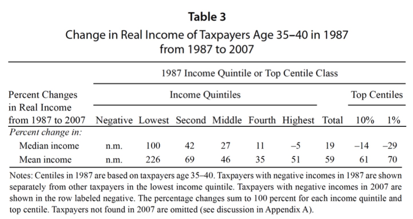
They are looking at people who were 35-40 in 1987 and seeing how they end up 20 years later, when they are 55-60. The median income of the people in the top 20% in 1987 ended up 5% lower twenty years later. The people in the middle 20% ended up with median income that was 27% higher. And if you started in the bottom 20%, your income doubled. If you were in the top 1% in 1987, 20 years later, median income was 29% lower.
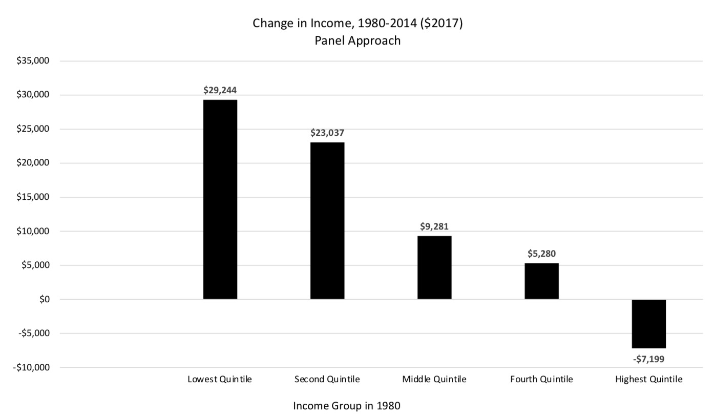
A recent study by David Splinter of the Joint Committee on Taxation looks at a narrower definition of income using tax data.8 Splinter has an estimate of the impact on growth on the different parts of the income distribution where, like many other estimates, he takes a snapshot of the income distribution in an early period, in this case, 1980, and compares it to the distribution at a later time, 2014. That is, he follows the quintiles over time, rather than the people, the standard approach of the pessimistic studies. And he finds that the bottom quintile in 2014 has less income than the bottom in 1980. Like Piketty, Saez, and Zucman, he finds essentially no gain for the bottom half of the income distribution.
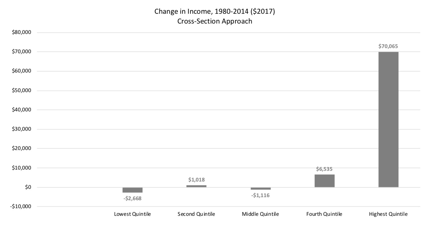
Only the people at the top gain much of anything between 1980 and 2014. The average income of the top 1% (not shown in the figure) went from $189,000 to $843,000, which seems to confirm the view that most of the gains from economic growth go to the richest of the rich while people in the middle or the bottom make no progress at all. But the people in the top 1% in 2014 are not the same people in 1980. What happens when you follow the same people? Splinter makes that calculation as well:
As before, when you follow the same people, the biggest gains go to the poorest people. The richest people in 1980 actually ended up poorer, on average, in 2014. Like the top 20%, the top 1% in 1980 were also poorer on average 34 years later in 2014. The gloomiest picture of the American economy is not accurate. The rich don’t get all the gains. The poor and middle class are not stagnating. Splinter reminds readers that the pattern here is more important than the size of the changes—he points out that tax returns grossly understate actual income, capturing only about 60% of the total in recent decades. And some of what he is capturing may be life-cycle effects that differ by quintile. But his findings are a dramatic example of the potential of cross-sections—two snapshots in time—to mislead compared to a panel approach where the same people are followed over time.
What remains true from the pessimistic stories is that the richest people in 2014 are much richer than the richest people in 1980. But they’re not the same people. It’s also true that there is a limited amount of relative mobility—while rich people in 1980 actually lost ground 34 years later on average, they still have a much higher income on average than the people who were poor in 1980. But the income gap between the actual people in 1980 actually got smaller over time. One of the lessons of Splinter’s work is that income in any one year is not necessarily representative of your economic status in the future.
All of these studies show that the economic growth of the last 30-40 years has been shared much more widely than is generally found in the cross-section studies that compare snapshots over time. No one of these studies is decisive. They each make different assumptions about income, what people to include, how to handle inflation. Together they suggest the glass isn’t as empty as we’ve been led to believe. It’s at least half-full.
This does not mean that everything is fine in the American economy. There are special privileges reserved for the rich that help them reduce their risk of downward mobility— financial bailouts are the most egregious example. There are too many barriers like occupational licensing and the minimum wage that handicap the disadvantaged desperately trying to succeed in the workplace. And the American public school system is an utter failure for too many children who need to acquire the skills needed for the 21st century. But the glass is at least half-full. If we want to give all Americans a chance to thrive, we should understand that the standard story is more complicated than we’ve been hearing.
- “Distributional National Accounts: Methods and Estimates for the United States,” by Thomas Piketty, Emmanuel Saez, and Gabriel Zucman, Quarterly Journal of Economics, December 2016: https://eml.berkeley.edu/~saez/PSZ2018QJE. ↩
- “On Income Stagnation,” by Paul Krugman, New York Times, November 12, 2014. https://krugman.blogs.nytimes.com/2014/11/12/on-income-stagnation/ ↩
- “Piketty’s Arguments Still Holds Up, After Taxes,” by Jared Bernstein, May 9, 2014: https://www.nytimes.com/2014/05/10/upshot/pikettys-arguments-still-hold-up-after-taxes.html ↩
- “Pursuing the American Dream: Economic Mobility Across Generations,” by Leonard Lopoo and Thomas DeLeire, Pew Charitable Trusts, July 2012. The study defines income “as the total income derived from the taxable income (such as earnings, interest, and dividends) and cash transfers (such as Social Security and welfare) of the head, spouse, and other family members. The PSID definition
of family used in this analysis includes single-person families and unmarried cohabiting couples who share resources, in addition to families related by blood, marriage, or adoption. Family income does not include the value of non-cash compensation such as employer contributions to health insurance and retirement benefits, nor does it include the effect of taxes or non-cash benefits such as food stamps. More information here: https://www.pewtrusts.org/~/media/legacy/uploadedfiles/pcs_assets/2012/pursuingamericandreampdf.pdf ↩ - “The Fading American Dream: Trends in Absolute Income Mobility Since 1940” by Raj Chetty, David Grusky, Maximilian Hell, Nathaniel Hendren, Robert Manduca, Jimmy Narang, Science 356(6336): 398-406, 2017 http://www.equality-of-opportunity.org/papers/abs_mobility_paper.pdf ↩
- “Economic Mobility of Families Across Generations,” by Julia Isaacs, Economic Mobility Project, Pew Charitable Trusts. Parents income is from 1967-1971. Children’s income as adults is taken from 1995- 2002. Isaacs writes: “Family cash income is the focus of the analysis, including taxable income (such as earnings, interest and dividends) and cash transfers (such as Social Security and welfare) of the head, spouse and other family members… As discussed in Appendix B, family cash income does not include the value of non-cash compensation such as employer contributions to health insurance and retirement benefits, nor does it include the effect of taxes or non-cash benefits such as food stamps. All incomes are reported in 2006 dollars, using the CPI-U-RS to adjust for inflation.” https://www.brookings.edu/wp- content/uploads/2016/06/11_generations_isaacs.pdf ↩
- “New Perspectives on Income Mobility and Inequality,” by Gerald Auten, Geoffrey Gee, and Nicholas
Turner, National Tax Journal, December 2013. “The measure of cash income used in this paper starts with total income as reported on individual income tax returns and then adds known sources of non- taxable income and adjusts for several items where the tax treatment differs from what might be considered a better measure of the current income realized by a taxpayer. In particular, tax exempt interest, non-taxable Social Security benefits, non-taxed unemployment compensation (2009 only), excluded foreign wages and housing benefits, excluded capital gains on small business stock, and net operating loss carryovers reflecting prior year losses are added. State tax refunds, alimony paid, the itemized deduction for gambling losses (up to the amount of gambling income reported), and disallowed current year passive losses are deducted.” https://www.ntanet.org/NTJ/66/4/ntj-v66n04p893-912-new- perpectives-income-mobility.pdf ↩ - “Income Mobility and Inequality in the United States: Evidence from Tax Data since 1979,” by David Splinter September 13, 2018. “The first income definition is fiscal income including capital gains. This is defined the same as tax return-based market income in Piketty and Saez (2003)—adjusted gross income (AGI), plus adjustments and excluded Schedule D capital gains before 1987, less government transfers in AGI (unemployment and taxable Social Security benefits)—but capital losses reported on Form 1040 are replaced with losses before limitations. Unfortunately, fiscal income is limited to income reported on tax returns, and therefore only captures 60 percent of national income in recent decades (Auten and Splinter, 2018; Piketty, Saez, and Zucman, 2018)… For absolute mobility estimates, fiscal income excluding capital gains is used to limit sensitivity to business cycles.” http://www.davidsplinter.com/Splinter- Mobility_and_Inequality.pdf. The results shown in the charts are taken from his online spreadsheet: http://davidsplinter.com/Splinter-Mobility_and_Inequalitya.xlsx ↩